
I design systems that simplify complex workflows and reduce user error.
Texas A&M (TeamUp Program) - UX Designer
As a UX Designer in the Texas A&M TeamUp program, I collaborated with engineering teams to design accessible, scalable user experiences for student-led products.
I focused on improving information architecture, user flows, and consistency across the product, while advocating for user-centered design in a fast-paced, assumption-driven environment.
TeamUp
“Teamup is a nonprofit organization that promotes project-based learning and empowers students to build technology focused on driving positive social change.”
- Teamup.org
TeamUp’s Design System
I created a scalable design system to support consistency across current and future products.
The goal was to establish a shared foundation that designers could reuse across different projects, reducing repeated design decisions and improving alignment between teams.
To support this, I defined a flexible token system, reusable components, and clear documentation so the system could be easily adopted and maintained over time.
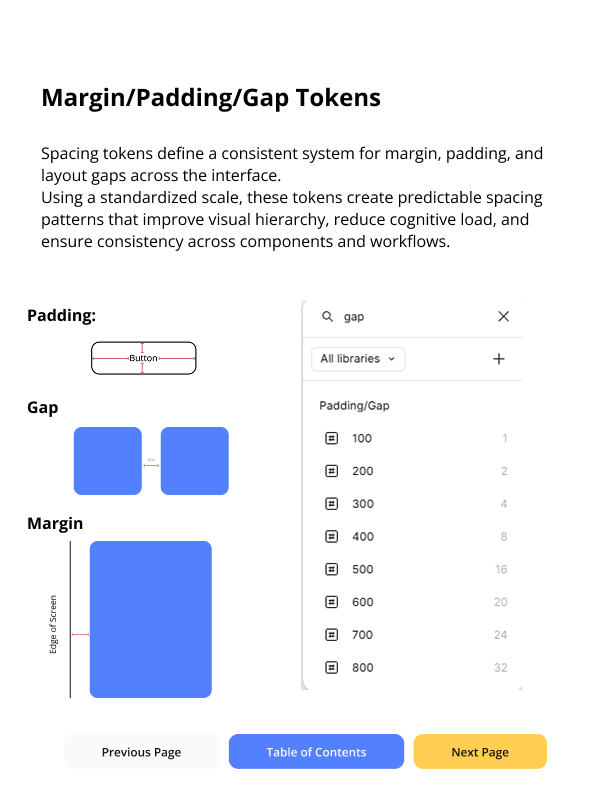
Establishing Design Tokens for Cross-Project Consistency
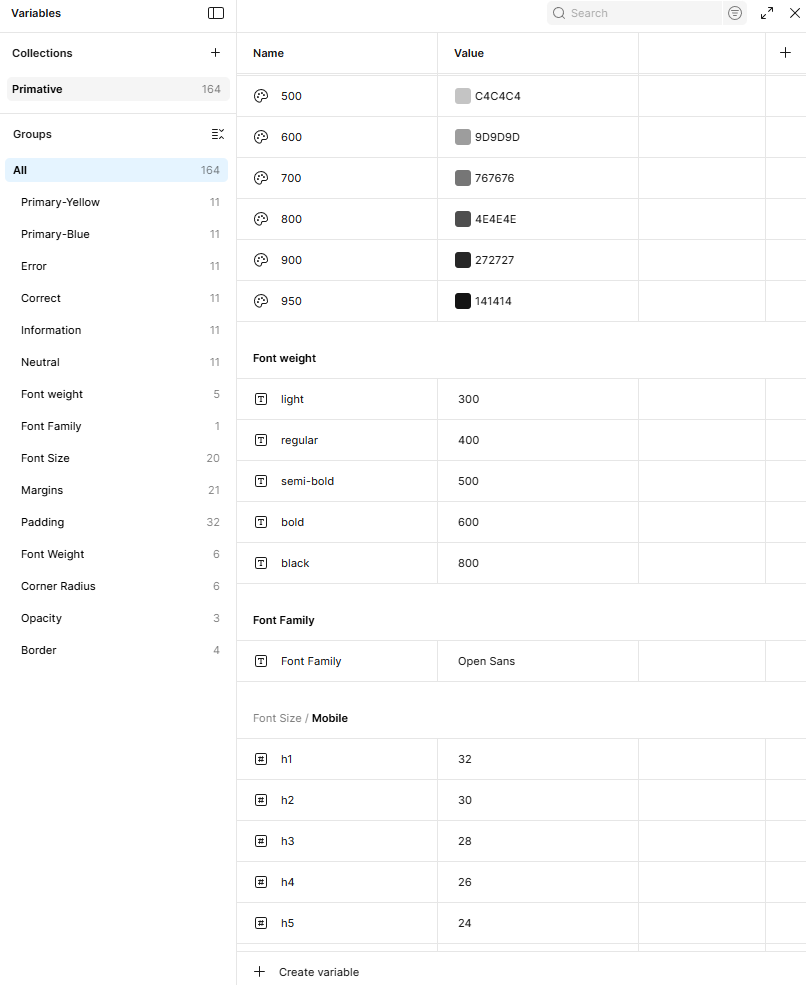
Defined a scalable token system using a 50–950 structure to ensure consistent usage across projects, UI states, and future product development.
The stakeholder needed a design system that could scale across both current and future projects.
Without a shared foundation, each project risked developing inconsistent patterns, increasing complexity for users and inefficiencies for teams.
What I did
I defined a set of design tokens to create a consistent visual and structural foundation across projects.
These tokens included color, typography, spacing, and layout rules, establishing a single source of truth that could scale across multiple products.
Key Insights
Because the system needed to support multiple projects, I focused on creating tokens that were flexible and reusable rather than tied to a single interface.
This allowed new features and future products to adopt the system without requiring redesigns, reducing long-term maintenance and design overhead.

Designed for Scalability and Consistency
This system was designed to create a consistent foundation across projects while reducing repeated design decisions.
By establishing a shared foundation, it simplifies collaboration between designers and developers and creates a structure that scales with new features and products.
Ensure consistency across multiple projects
Reduce duplicated design decisions
Simplify developer handoff through standardized values
Support scalable growth across future products

Typography System
Defined a responsive typography system to maintain hierarchy and consistency across mobile and desktop experiences.
The system uses a structured type scale to support clear information hierarchy and ensure accessibility across different screen sizes.
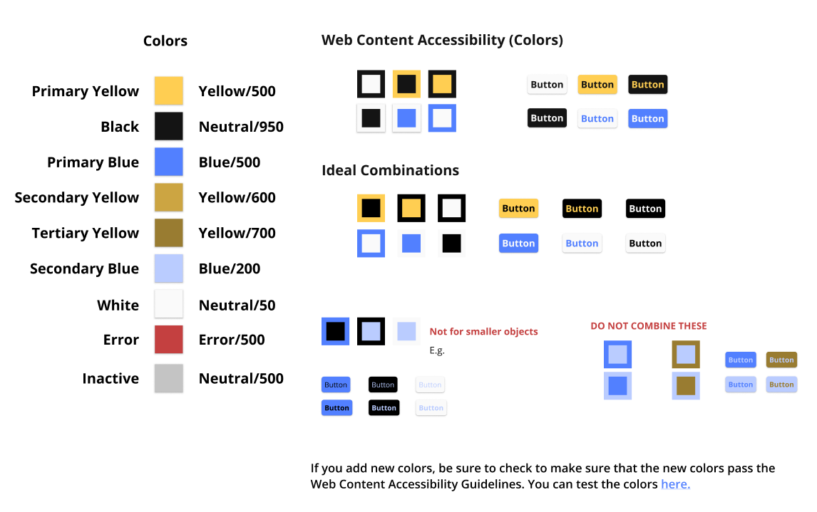
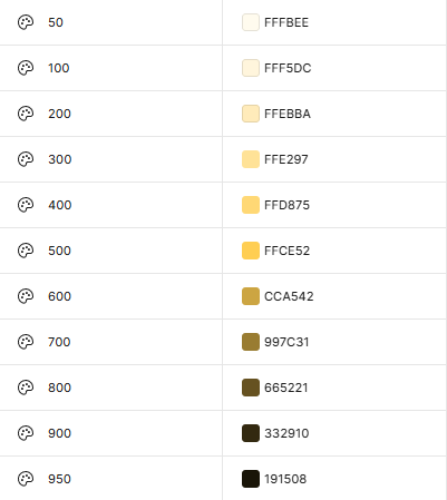
Color System
Defined a color system that balances visual hierarchy, usability, and accessibility across the interface.
Color tokens were structured by semantic purpose (primary, neutral, error, inactive) to ensure consistent usage across components and states.
Created an IFU (Instructions for Use) document to guide accessible color usage, ensuring sufficient contrast and consistent application across the system.

With foundational elements established, I translated the system into reusable components to ensure consistency and scalability across the product.
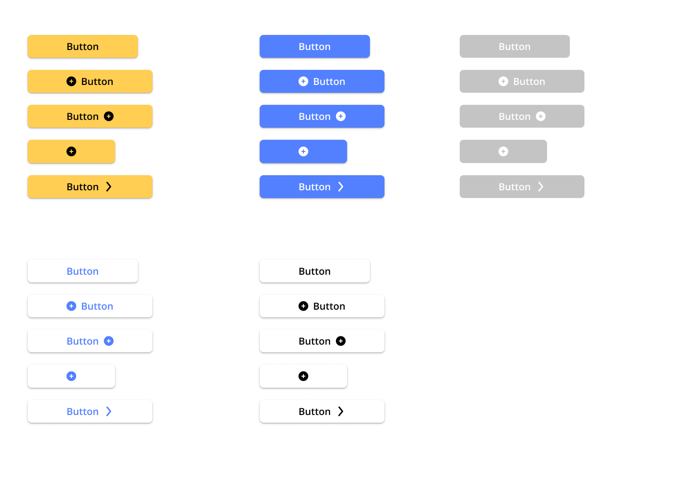
Button and Button Variants
Defined a standardized button system to ensure consistent interactions and reduce UI variability across the product.
Each button variant was designed to support specific use cases and states, ensuring clarity, accessibility, and predictable user behavior.
Primary buttons highlight the main action within a workflow
States (hover, active, disabled) provide clear interaction feedback
Disabled states prevent invalid actions and reduce user error
Color variants communicate hierarchy and intent (e.g., primary, secondary, destructive)
Dropdown buttons support grouped actions without increasing visual clutter
Icon placement improves clarity and supports quick recognition of actions
Reusable button system designed to standardize interactions and ensure consistent behavior across the interface.

Establishing a Layout System
Defined a consistent layout system to maintain alignment, spacing, and visual hierarchy across both mobile and desktop experiences.
A structured grid ensures predictable layouts and reduces inconsistencies between screens, improving usability and scalability across the product.
Mobile
Gutter: 20px
Margin: 20px
Desktop
Gutter: 20px
Margin: 80px

Element Layout
Defined a spacing system using a 4px baseline grid to maintain consistent spacing and alignment across the interface.
Spacing values were standardized to create clear visual hierarchy, support logical grouping of content, and ensure consistency across both mobile and desktop layouts.
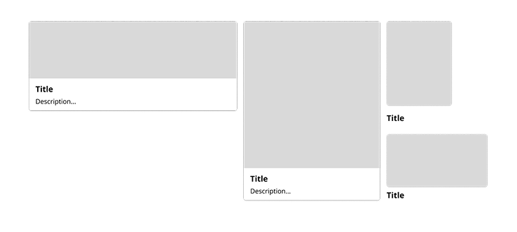
Cards
Defined a reusable card system to organize content and maintain consistency across layouts and use cases.
Each card uses standardized spacing, typography, and structure to ensure consistent structure and readability across devices.
Component Hierarchy and Depth
I used cards, spacing, and elevation to create clear structure and hierarchy across the interface.
This helped separate content, reinforce grouping, and make it easier for users to understand what to focus on.
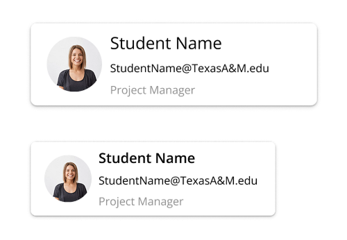
Profiles
I designed profile components to present user information in a clear and consistent way across the interface.
Each profile follows a structured layout to make key details like name, role, and contact information easy to scan and understand.
Drop Shadows
I used drop shadows to create clear separation between elements and reinforce visual hierarchy across the interface.
Shadows help distinguish layered components like cards and interactive elements, making it easier for users to understand structure and focus.
Used consistently, shadows support depth without adding unnecessary visual noise.
Making the System Usable
To ensure the system could be consistently applied across projects, I created an IFU (Instructions for Use) document that defined how tokens, components, and color combinations should be used.
This provided clear guidance for designers, reducing ambiguity in decisions like color contrast and component usage, and making the system easier to adopt across teams.
The TeamUp Design System includes a wide range of components and patterns beyond what’s shown here.
To keep this case study focused, I’ve highlighted key elements, with access to the full system and a complete component library below.
Additional TeamUp Projects
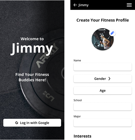
Jimmy Application
Sep. 2024 - Nov. 2024
Jimmy is a gym partner matching app designed to help students find compatible workout partners based on shared interests.
I created high-fidelity wireframes and designed the social chat experience, focusing on clear user flows and intuitive interaction patterns.
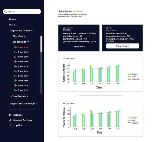
ReadWell
May - Aug. 2024
ReadWell is a student-led EdTech platform designed to improve reading comprehension and speed through AI-assisted learning tools.
I designed the information architecture, style guides, and both low- and high-fidelity wireframes to create a clear and scalable user experience.