


Rock Gym Pro: Reducing Membership Setup Errors in a Complex CRM System
I identified the root causes of these errors and redesigned key workflows to reduce friction, improve accuracy, and streamline the membership setup process.
At Gripstone Climbing and Fitness, 3 out of 7 memberships were being set up incorrectly, requiring manual intervention to identify and resolve errors.
Missing or incorrect membership documentation
Improper billing attachments
Incorrect gear or discount configurations
Missing billing contacts
Unassigned scan cards
Incorrect billing dates
These recurring errors pointed to a deeper issue: the system’s complexity created inconsistent workflows and a high risk of human error.

The Problem
Although Rock Gym Pro offers a wide array of features, its complexity introduces fragmented workflows that make accurate membership setup difficult to execute consistently.
To compensate for recurring errors, the team implemented a nightly manual audit process.
By analyzing the workflow and system behavior, I identified several systemic issues driving these errors:
Lack of guided workflows, requiring staff to navigate multiple disconnected steps without clear direction
Inconsistent UI patterns, making similar actions behave differently across the system
Over-reliance on manual input, increasing the likelihood of missed or incorrect data
No validation or error prevention, allowing incorrect configurations to be saved without feedback
These issues created a fragmented experience that increased cognitive load, introduced frequent errors, and forced teams to rely on manual correction to maintain accuracy.

The Goal
Redesign the membership setup experience to reduce dependency on manual input, introduce guided workflows, and implement system-level safeguards that prevent errors before they occur.
The Question
How might we redesign the membership setup experience to reduce human error and create a more reliable, scalable workflow?
Step One: Research
To understand how system complexity was impacting real-world workflows, I conducted observational research with 9 staff members as they set up memberships in Rock Gym Pro.
This revealed patterns in how users navigated the system, where errors occurred, and how staff compensated for gaps in the product experience.
Key observations included:
Inconsistent workflows, with staff navigating different paths to complete the same task
Reliance on memory and manual checks due to lack of system guidance
Workarounds developed to compensate for missing validation and unclear UI patterns
Variability in speed, confidence, and error rates across staff members
These insights confirmed that errors were not isolated incidents, but the result of systemic issues within the product.Findings
Quick Configure vs Manual Setup
Despite the availability of an automated “Quick Configure” feature, staff behavior revealed a lack of trust in the system:
5 out of 9 staff members used Quick Configure, which autofilled customer type and payment status
4 out of 9 staff members chose to manually set up memberships from scratch
Even when using Quick Configure, staff consistently double-checked every field—eliminating any time-saving benefit.
This behavior pointed to a critical issue:
The problem wasn’t functionality, it was transparency.
Staff did not trust the system’s autofill logic because they couldn’t see or verify how decisions were being made. As a result, they relied on manual processes to maintain a sense of control and accuracy.
One participant summarized this clearly:
“I don’t use Quick Configure because I don’t trust it. I trust myself more than the system. I know I’ve gone through each step.”
This revealed that the system’s lack of visibility into automated actions led to hesitation, redundant work, and reduced efficiency.
Step Two: Ideate
Based on these insights, I identified three key design directions:Increase trust in automated workflows to improve adoption and reduce manual verification
Make system actions and setup steps more transparent and predictable across both automated and manual flows
Reduce complexity in the membership setup process without compromising user control or accountability

Step Three: The Solution
To address the lack of transparency and inconsistent workflows, I analyzed the end-to-end membership setup process to understand how the system actually behaved in real use.
I mapped the full task flow for setting up a family membership with auto-billing, identifying key points where users experienced confusion, inconsistency, or errors.
This analysis revealed several critical breakdowns:
Key steps were hidden or unclear, forcing users to rely on memory instead of system guidance
Similar actions behaved differently across workflows, increasing cognitive load
Users had no visibility into automated decisions, reducing trust in the system
Critical validation steps were missing, allowing errors to pass through unnoticed
These gaps reinforced the need for a more structured and transparent system that could guide users, standardize interactions, and prevent errors before they occurred.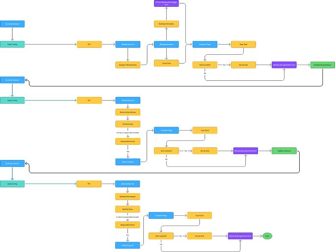
Mapping the Current Process
To understand how these issues manifested in practice, I mapped the full task flow for setting up a family membership with auto-billing.
This visualization revealed several key problems in the system:
Multiple entry points led to inconsistent workflows for the same task
Critical steps were buried or skipped entirely depending on the path taken
Similar actions appeared in different locations with inconsistent behavior
The system lacked clear guidance, forcing users to rely on memory and manual checks
This fragmentation made the process difficult to follow, increased cognitive load, and contributed directly to the errors observed during research.Current Experience in Action
To validate how these issues impact real workflows, I recorded a walkthrough of the current membership setup process.
Key Friction Points Observed
Users navigate multiple disconnected screens to complete a single task
Critical steps are not surfaced at the right time, leading to missed configurations
Similar actions behave differently across workflows, creating confusion
No validation or system feedback to prevent incorrect setup
Users rely on memory and manual checks instead of system guidance
Step Four: Guided Interaction, Not Blind Automation
Instead of hiding complexity behind automation, I designed a system that guides users through a transparent, step-by-step workflow:
Structured steps – Each stage of the setup process is clearly presented and sequenced
Visible automation – Autofilled fields are exposed and editable, allowing users to verify system decisions
Progressive confirmation – Users review and confirm key inputs as they move forward
Built-in validation – Errors are prevented in real time rather than discovered after submission
This approach transforms the experience from a fragmented, error-prone process into a guided system that supports user decision-making, increases confidence, and reduces errors without sacrificing efficiency.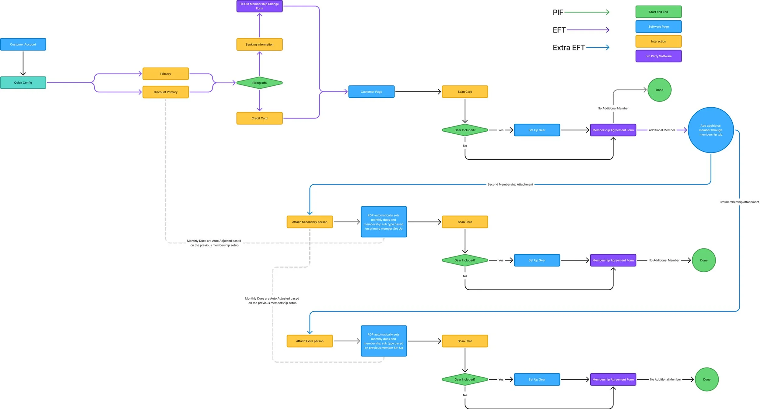
From Fragmented to Guided Workflow
To simplify the experience and reduce errors, I redesigned the membership setup flow into a structured, guided process.
This new flow reduces unnecessary branching, surfaces critical steps at the right time, and ensures consistency across all setup paths.How is the new flow actually better in practice?
Notice how the system surfaces key steps at the right time, provides real-time validation, and reduces the need for manual verification.Compared to the previous experience, this flow reduces friction, eliminates guesswork, and creates a clear, predictable path to completion.Notice how the system surfaces key steps at the right time, provides real-time validation, and reduces the need for manual verification.Key Improvements:
Consolidated entry points into a single guided flow
Surfaced critical steps (billing, agreements) at the right time
Standardized interactions across all membership types
Reduced reliance on memory with clear, sequential steps
This redesign reduces cognitive load by guiding users through a predictable, step-by-step process rather than forcing them to navigate multiple disconnected paths.Conclusion
This redesign transforms a fragmented, error-prone membership setup process into a structured, guided workflow that reduces friction, increases accuracy, and improves overall efficiency.
At the core of this solution is a guided workflow that makes each step visible, structured, and user-controlled. Instead of hiding complexity behind automation, the system provides transparent, editable checkpoints that allow users to understand, verify, and confidently complete each step.
This approach builds trust, reduces cognitive load, and allows the system to handle complexity without sacrificing user control.
The result is a process that:
Reduces human error
Increases efficiency by over 130% by reducing redundant steps and manual verification
Improves staff onboarding
Strengthens overall trust in the system
After completing the project, I reached out to the company to share these proposed improvements and offered to walk through the redesigned workflow. While I have not yet received a response, this reflects my commitment to creating actionable, real-world solutions beyond conceptual design.